Welpco
Lend a hand.
A brand to connect people and make everyday life easier.
- Client
- Welpco
- Sector
- Local services, digital marketplace
- Market
- Quebec, Canada
- Year
- July 2024
- Scope
- Brand strategy, verbal and visual identity, brand applications
- Team
- Margareth Colina, creative direction, design and logotype
Jesús Llancare, symbol
Mónica Colina, brand animation
One platform. Two ways to improve everyday life.
Welpco is a digital marketplace that connects people who need services for their home with providers from their community, called Welpers. For a family, finding help means deciding who to trust with their home and their time. For a provider, it means finding opportunities that fit their skills and availability. The challenge was to build trust between two different audiences under one brand, and to explain a wide range of services with a benefit that is easy to understand.
Asking for help is easier when you know who you can count on.
Local help as a brand idea
Analyzing the brief, the category and the audience profiles organized the priorities around three axes: trust, simplicity and local connection. From there came the tagline Lend a hand, an everyday expression that sums up the willingness to help and the role Welpco wants to play in its community.
For those who hire
A way to find local help for different home needs from one place, reducing the effort of searching and coordinating.
Two proposals, one purpose: making everyday life easier by strengthening connections within the community.
People and efficiency, in a single symbol
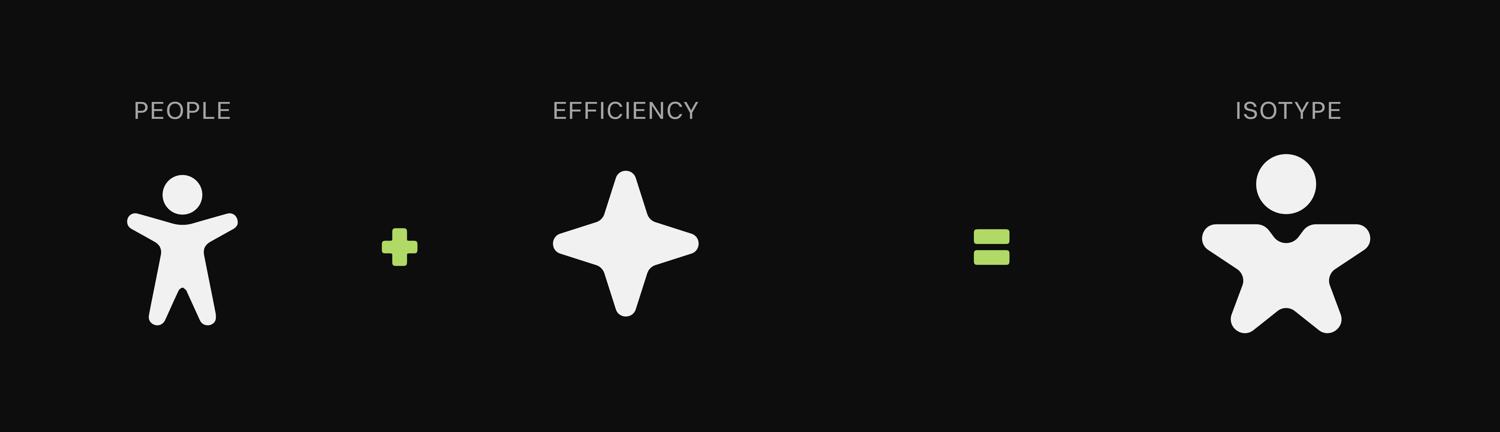
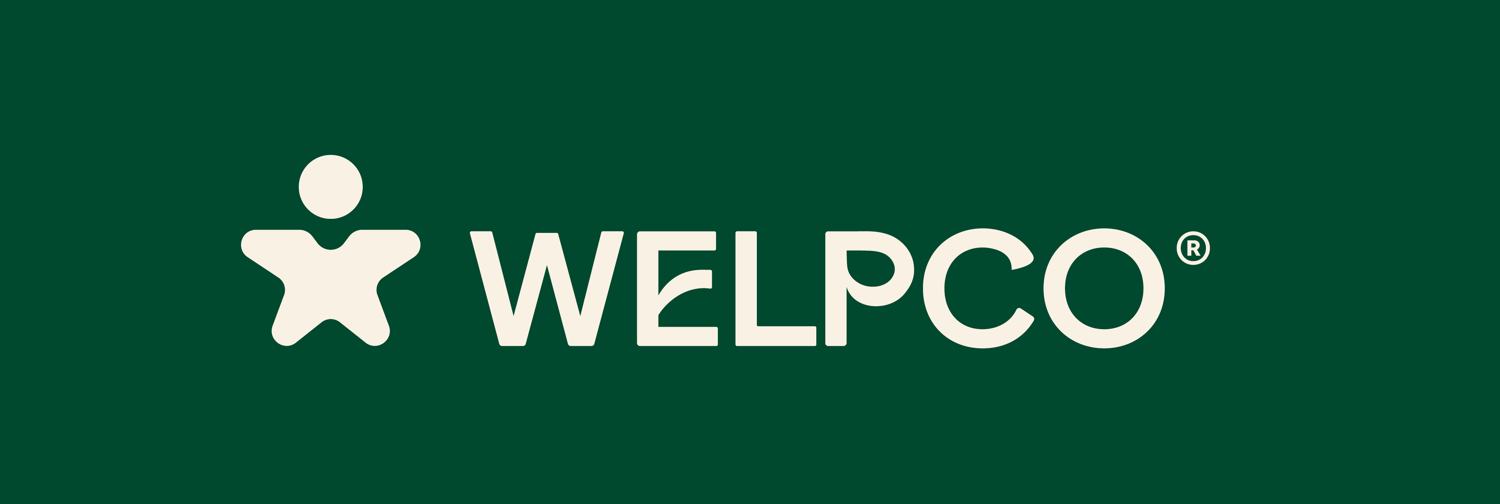
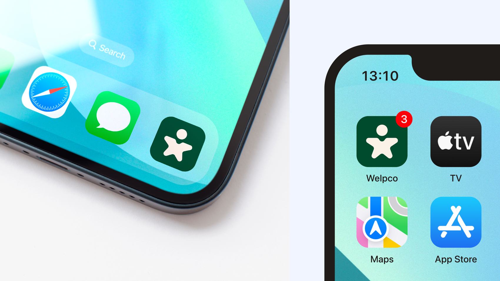
The symbol combines a human figure with a star shape associated with efficiency. The union sums up the two principles of the brand: the people who make the service possible and the will to make everyday life easier. Its soft contours carry Welpco's approachable character, and its compact shape lets it be used next to the name or on its own, as in the app icon.

A name with a character of its own
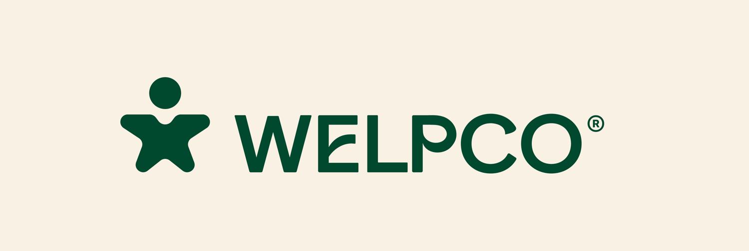
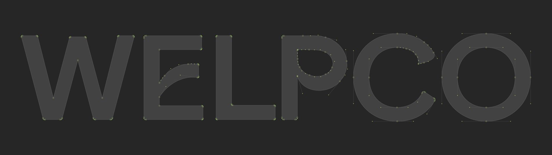
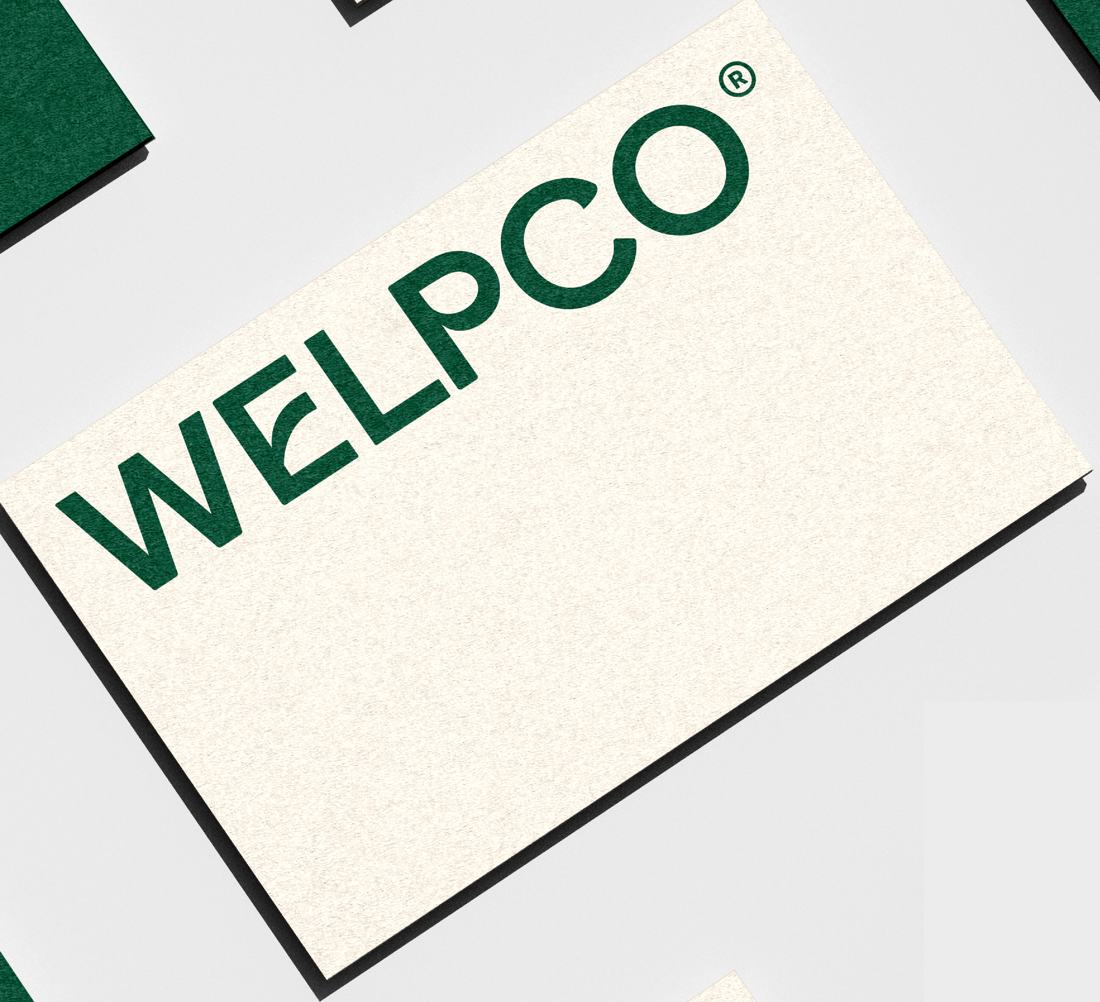
The logotype uses a custom sans serif construction, with particular adjustments to the letters E, L, P and C and a subtle rounding of the edges. Those details give the name a voice of its own and keep it consistent with the soft shapes of the symbol.
A steady base, with room for energy
The color system is organized around deep green and cream tones: a recognizable, warm presence. The bright green brings energy to accents and highlights. The secondary palette widens the possibilities and lets service categories stand apart while keeping a shared visual base.
Base and accents
Service categories
Click a color to copy its HEX.
Service categories set apart with the secondary palette
Typography to guide the information
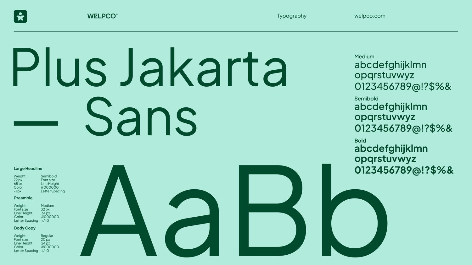
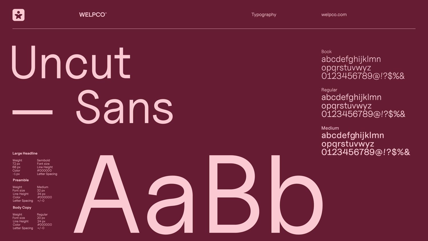
Plus Jakarta Sans gives presence to headlines and Uncut Sans supports body and long-form text. The relationship between the two sets a consistent hierarchy for corporate and digital communications, with a warm, direct and professional voice.
A system designed for different touchpoints
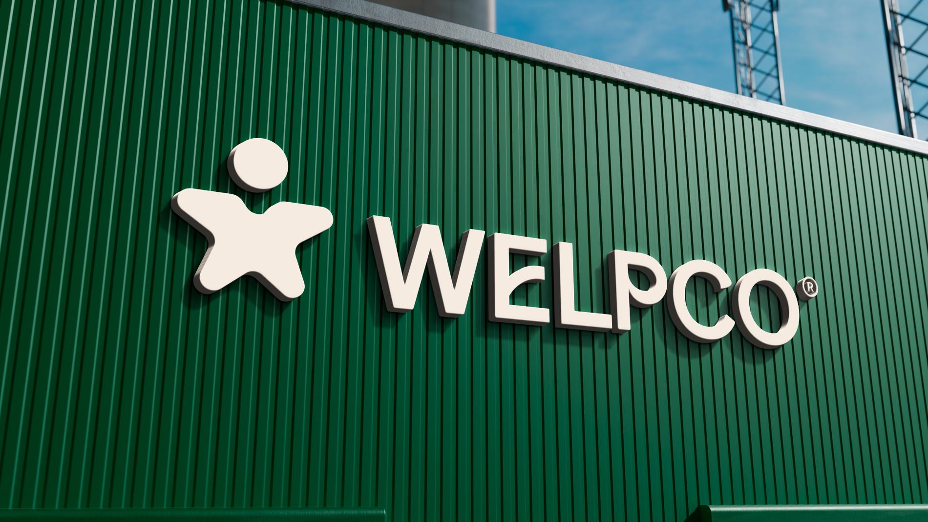
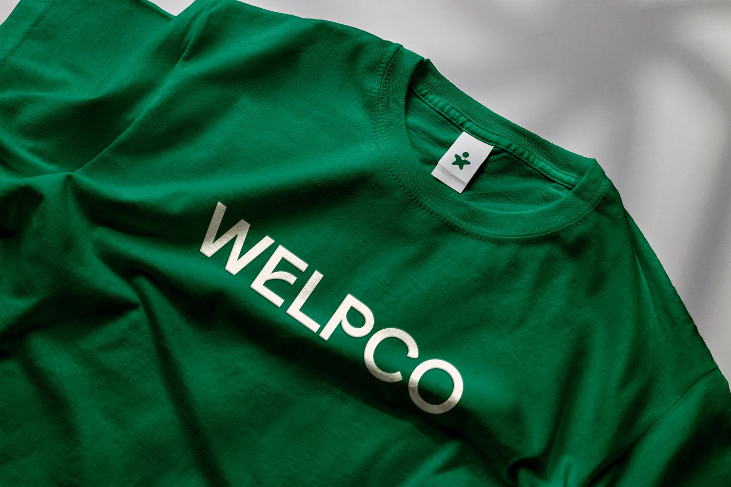
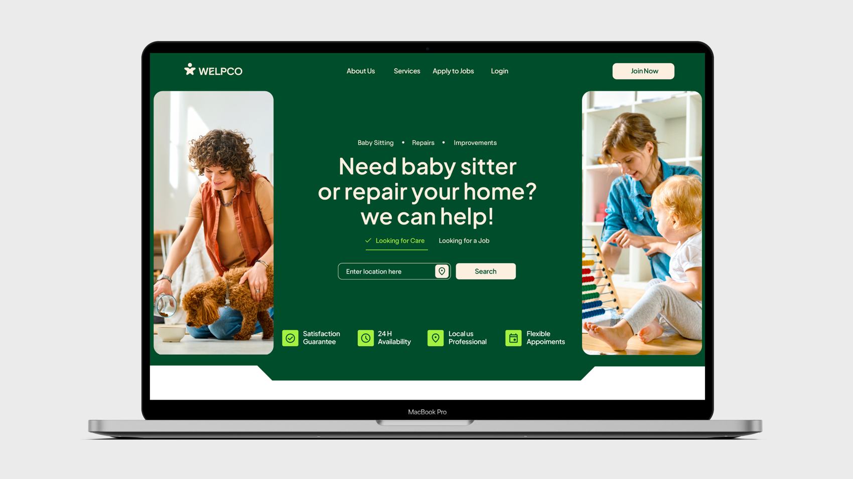
The identity was presented across signage, cards, a t-shirt, an app icon, a visual proposal for the homepage and communication compositions. The pieces show how the symbol, color and typography stay consistent as scale, medium and context change.
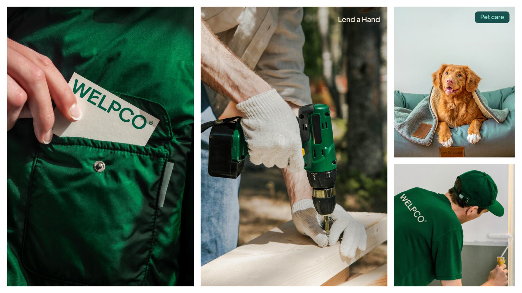
The result is an identity that turns Welpco's positioning into concrete resources: a symbol centered on people, a name with character of its own and a visual system that supports the diversity of the platform's services.
Welpco.
Lend a hand.