Vass
Procurement and services for the hydrocarbon sector.
Brand identity for a company that brings together equipment, advisory and training.
- Client
- Vass
- Sector
- Procurement and oil services
- Market
- Venezuela
- Year
- August 2023
- Scope
- Visual identity and brand applications
- Team
- Margareth Colina, creative direction and design
Cristian Sanabria, design and symbol
Bringing three services under one brand
VASS grew out of the initiative of a petroleum engineer with more than thirty years of experience in the sector. The company brings together the sale of industrial and oil production equipment, advisory in integrated reservoir management and training plans for personnel. It was a new company with a diverse offer: it needed a professional presence that conveyed expertise and kept the closeness its founder considers essential in business relationships.
Experience with a human touch.
The client's phrase that guided the brand.A technical, legible and approachable brand
Knowledge of the oil business and a commitment to people gave the axis for organizing the discourse and the identity. The direction aims for a technical, legible and accessible expression, and a visual system that helps organize commercial and specialized information.
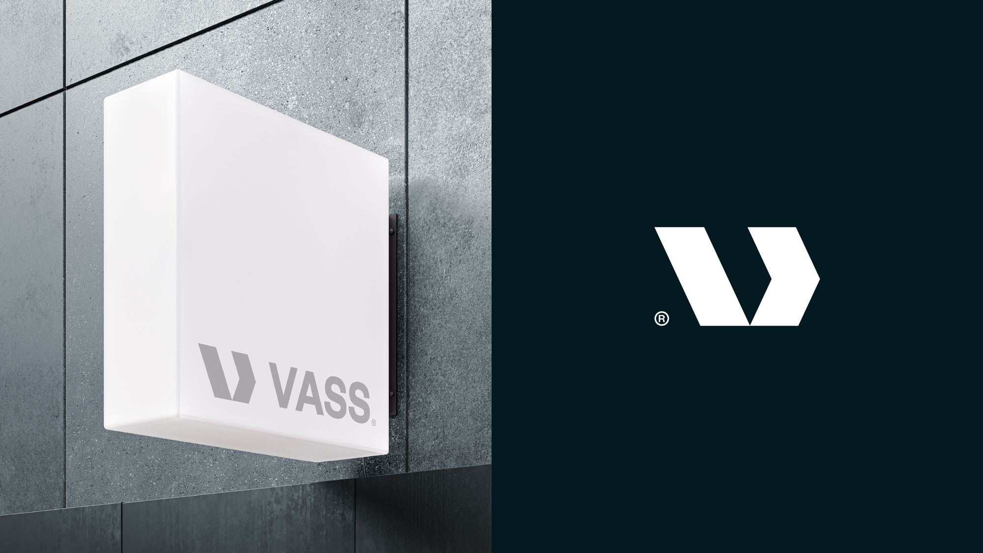
The symbol builds a V from two pieces: a slanted stroke and a chevron that looks forward. It reads clearly at any scale and works in a single ink.


Blue to trust, orange to move
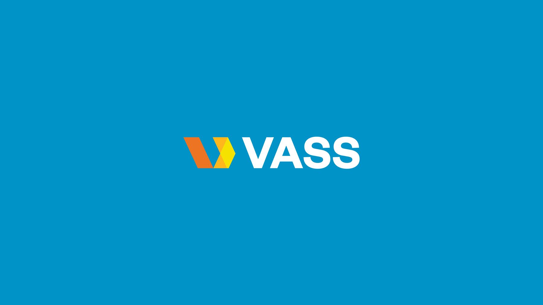
Blue, as the main color, sets Vass apart from its competition through a direct association with safety, trust and professionalism. It is joined by a much more vibrant orange, which brings the dynamism and energy that are also part of the company's essence.
Symbol colors
Brand colors
Hover a color to see its values and its place in the symbol. Click to copy its HEX.
Photographic style and use of color
The photographic direction carries the palette into the image: clean blue skies and industrial structures in cool tones, with orange and yellow accents that repeat the colors of the symbol. Compositions are orderly and airy, and people appear at work with the brand blue as the protagonist. The images in this section are references for that direction, not photographs of the company.







Image references for the sector
The brand in daily use
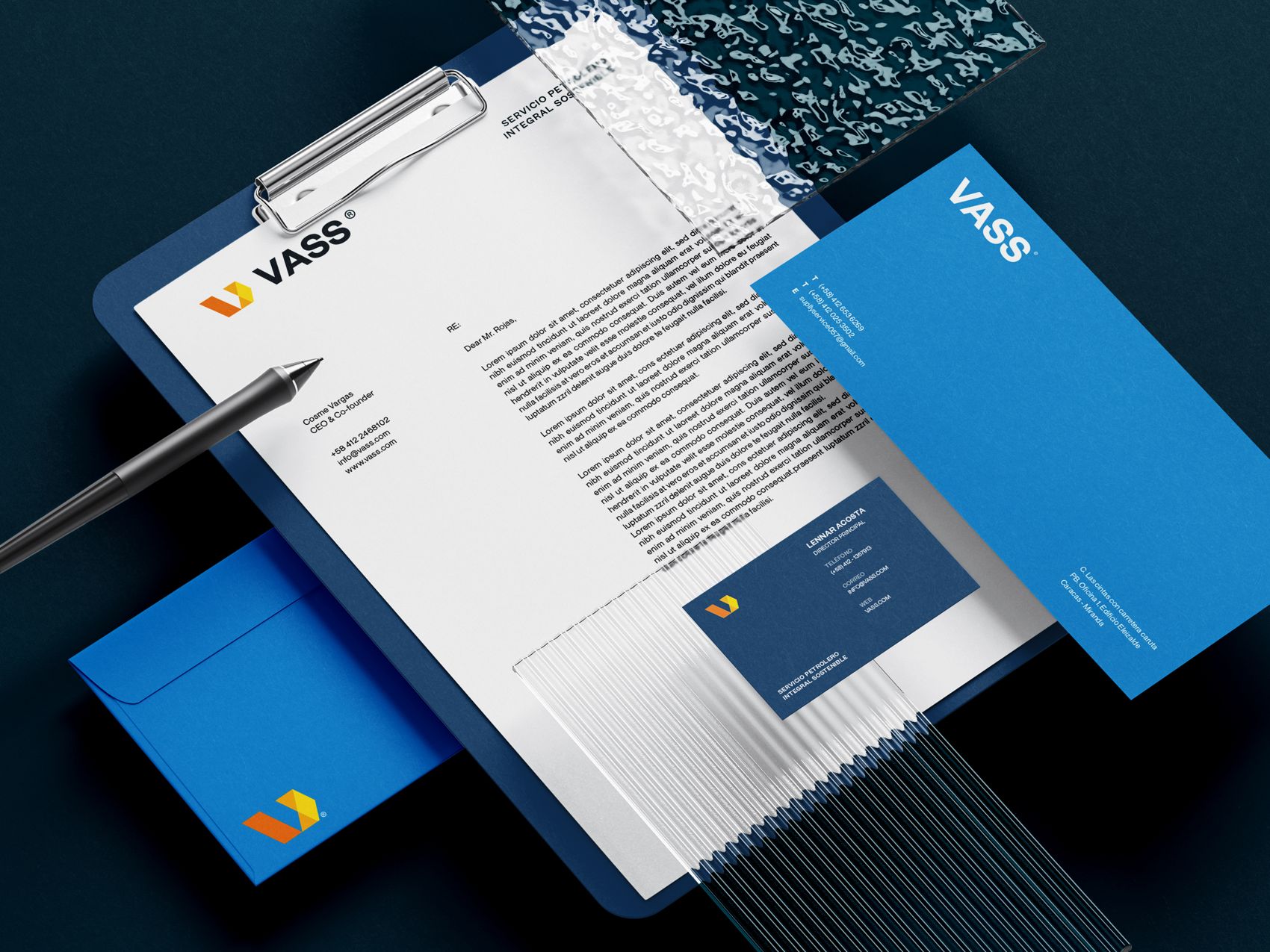
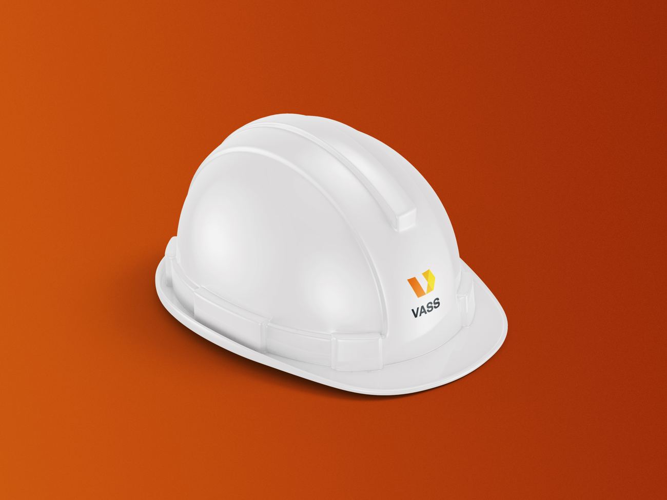
The system was taken to everyday pieces for the company: stationery, signage, a work uniform and a helmet. The logo adapts to each medium and stays legible even in a single ink.

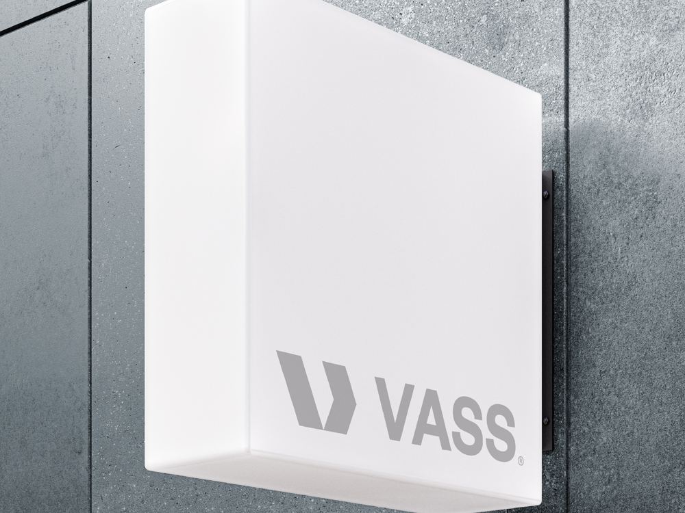
The result is an identity that brings equipment, advisory and training under one brand: a recognizable V, a palette that combines trust and energy, and a system designed to support the company's commercial presentation.
Vass.
Procurement and services for hydrocarbons.